Registering with MyAltro allows you to save all your favourite technical documents, blogs and videos in one place. Get access to exclusive content, additional technical support and more. Once you have submitted the registration form you will receive an email to verify your account. You will need to verify your account in order to log in, so follow the link in the verification email to complete this action.
When you set your password, it will need to be at least 8 characters including an upper case letter, a lower case letter, a number and a special character.
Enter your details below to login
Can't see the region you're looking for? You can find a list of our global locations here
You are currently on the site for Ireland. We think you might be looking for the site for United States/Canada.


This purpose-built dental clinic opened in the early 1950’s. The double-height space of the original entrance had become lost. Confused and cluttered over time at floor level, we needed to re-establish the original sense of volume in the design. Spatially, the design had to be welcoming and relaxing, so the original architecture gave us a great platform with two facing walls of glass and timber Japanese screen-effect, full height walls, and columns from ground to ceiling anchoring the entire volume. We were given the opportunity to strip this right back to these basic elements.
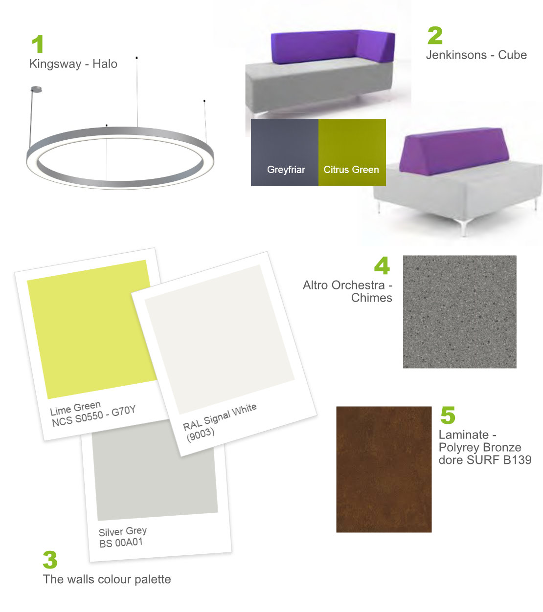
We filled the empty height space with halo lights, increasing the amount of light and drawing the eye up, making the space seem more open. The wooden screen-effect was painted white, immediately giving the space a lighter and taller feel.
The north-facing space was a mix of cool pastel colours with accents of blue and lilac furniture and with fixed elements in dark timber, all of which were removed. We introduced freshness and warmth with olive and lime tones, earthed by grey flooring to emulate a concourse. This opens up the space further as the floor was key to bringing the whole design together. This allowed us to express the new colour palette in the seating to build layers of colour; the seating appears to float and is instantly recognisable. The shades used have the effect of bringing the outside in: calm and natural, and the monochromatic look adds to the perception of space and cleanliness.
T-shaped seating positioned at the base of existing columns enabled adequate seating in the minimum amount of space and, having removed unnecessary signage, the new reception desk was framed by existing columns - all the sign-posting needed to tell a new arrival where to go.
Scroll down for more
Paul Allison
Director, HPDA Architecture
