Registering with MyAltro allows you to save all your favourite technical documents, blogs and videos in one place. Get access to exclusive content, additional technical support and more. Once you have submitted the registration form you will receive an email to verify your account. You will need to verify your account in order to log in, so follow the link in the verification email to complete this action.
When you set your password, it will need to be at least 8 characters including an upper case letter, a lower case letter, a number and a special character.
Enter your details below to login
Can't see the region you're looking for? You can find a list of our global locations here
You are currently on the site for Ireland. We think you might be looking for the site for United States/Canada.


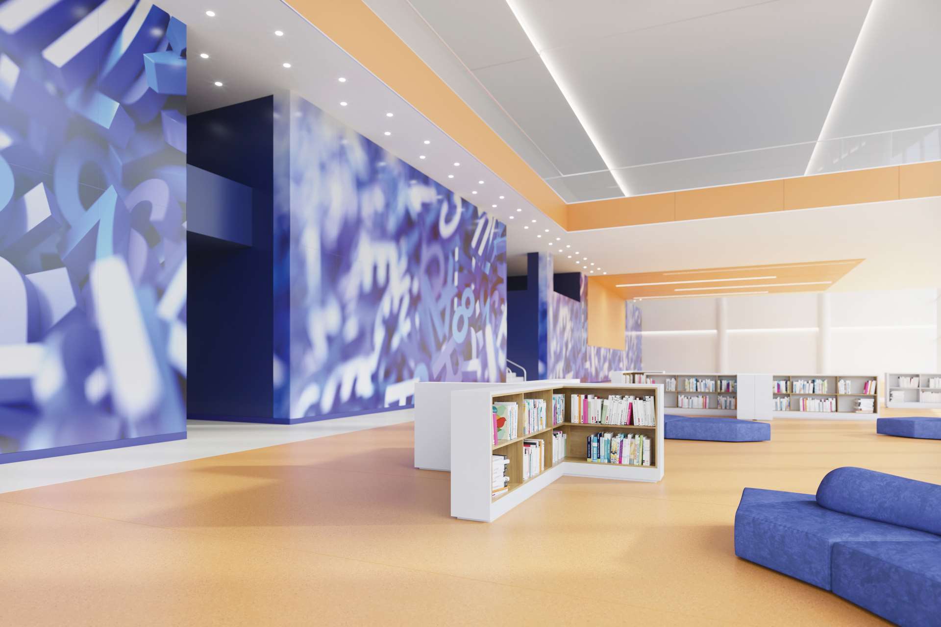
There is movement in this communal space, as well as students relaxing. For people to walk through and not feel in the way if they sit, or stand to chat, the floor creates zones, including a pathway. A minimalistic look to reduce the busy-ness, created with multiple straight lines and large matching colour blocks, offers a sense of theme and consistency. We have used letters and numbers on the walls to catch the eye - in this self-contained, functional space they inject vibrancy and relevance.
A pale ceiling and walls for the outside light to bounce off ensures the space is full of natural light. This allows a bold blue feature wall that stands out without dominating or darkening the space. We used suede, curved seats to give a soft-look, standing out from the surrounding surfaces. They look comfortable and inviting, showing it’s an area to be enjoyed and used, not just passed through on the way to somewhere else.
Scroll down for more
Luca Bellavita
Altro Design Manager
